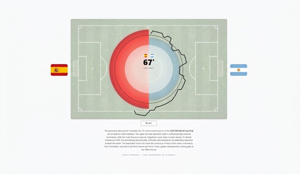
Momentum Analysis: World Cup Final 2026 - Spain vs Argentina
Interactive radial timeline capturing the tension and momentum shifts of the 2026 World Cup Final through an animated heartbeat visualization.
View details ?
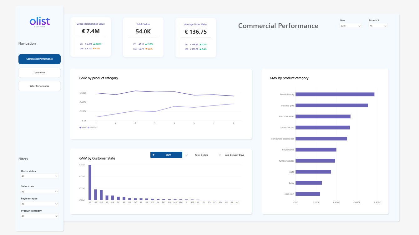
Olist E-Commerce Analytics Dashboard
Enterprise analytics solution for the Olist marketplace: transforming raw data into a multi-layered management tool with commercial performance, operational efficiency, and seller quality metrics.
View details ?
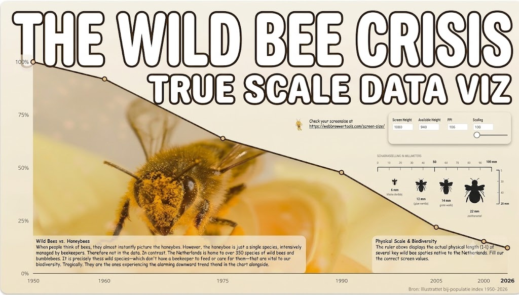
True Scale Data Viz: The Wild Bee Crisis
The Micro world: A dynamic, physical ruler that shows four wild bee species - from the Tiny Furrow Bee 6mm to the Buff-tailed Bumblebee 22mm - exactly 1:1 on true scale on your screen.
View details ?

Real-Time ISS Tracker: Fabric Eventstream & KQL Case Study
For this project, I built an end-to-end real-time data streaming pipeline that tracks the live location of the International Space Station (ISS) and visualizes its orbital path on a dynamic dashboard.
View details ?

Power BI Custom Visual Bubble to Bar
Custom HTML / CSS visual for age distribution by gender. Bubble to Bar chart moving elements.
View details ?

Pokémon Analytics
Welcome to The Ultimate Pokémon Analytics Suite! This is a custom, high-fidelity Power BI data visualization dashboard designed to break down Pokémon stats, attributes, and team combinations with a premium, arcade-style UI.
View details ?

Flow Ratio KPI Gauge Visual
Custom HTML/CSS KPI visual for real-time backlog health monitoring.
View details ?

Chocolate Consumption vs. Nobel Prize Winners
Does eating chocolate make a country smarter? Exploring the famous Messerli (2012) correlation (r ~= 0.88).
View details ?

Power BI Landing Page - 3D Particle Animation
Premium immersive portal with 8,000 morphing 3D particles using Three.js inside Power BI.
View details ?

Las Vegas Weddings vs. Polar Bear Activity
Do weddings in Vegas activate polar bears? Seasonal confounding creates a near-perfect r ~= 0.95 correlation.
View details ?

Divorce Rate vs. Margarine Consumption
Near-perfect spurious correlation (r ~= 0.99) between Maine divorces and US margarine consumption.
View details ?